Tag

Social Security

October 2013 Update : Social Security-Annual Change In Enrollment

By | Commentary

The October 2013 Social Security recipients report was released today showing a monthly increase of 110k people with an average monthly benefit of $1,163…up $1 over September. We continue to see a gradual slowdown…with 20k fewer new enrollments than last October’s 130k increase. The TTM delta is now at 1.227M, so averaging right at 100k per month, though there are large seasonal variations (which is why we look at the TTM).

For reference, we peaked at a TTM rate of 1.624M almost 4 years ago in 12/2009 and have been trending down since then. Still…1.227 is still very high historically. Looking back 10 years to 2013, the rate was under 600k. The course from here will be a very important factor in how quickly the budget deficit deteriorates over the next 5-10 years. On the positive side, though high, the rate is still trending down, and there is a good chance that a lot of the people you would have expected to be retiring now or soon actually already did….causing the 2009 spike…and the subsequent dip.

On the other side, we are still working through the left tail of the boomer  population distribution. I have a table published in 2011 that shows the US population by age. As of 2011, there were 2.7M of living Americans born in 1948….who would be turning 65 this year. Contrast that to those born in 1949 at 3.7M. Not sure what they put in the water that year, but roughly 1M more Americans will turn 65 in 2014 than in 2013. From here, we have a steady increase until 2028 when 4.6M born in 1963 will turn 65. Obviously that’s based on the 2011 snapshot and not adjusted for mortality. And while currently, people become eligible for Medicaid at 65, they can apply for SS anytime between 62 and 70…with the benefits growing the longer they wait.

So the main thing I am looking for with this data series is a bottom in the TTM rate and for the trend to turn back up. October 2013 was not that month. I don’t know if it happens next year, or five years from now, but when it does lookout because it’s going to get ugly(er).


September 2013 Update : Social Security-Annual Change In Retired Workers

By | Commentary

The September numbers were just released…. the total Social Security population grew 140k to 57.695M people, with the average recipient receiving $1,162 per month. Penciling that out yields a very large number, but that’s not really what I am interested in. I watch this series because I am looking for a material change in the rate of retirements….which is what we would expect some time soon as we get into the meat of the baby boomer retirements.

For some reference, in the late 90’s, we were adding about 300k people to Social Security programs(Old age and disability) per year. By 2006/2007, the rate had edged up to about 700k per year of additions before spiking to over 1.6M in 2009 as millions jumped onto Social Security/disability after losing jobs due to the recession. Since then, it had slowly been drifting down, with the latest annual rate being 1.248M additions per year. For the month, last September had 155k additions, 15k higher than this September so the slow drift downward is continuing, but we are still adding a lot of people each year.

I guess you could say it’s a good thing that the rate is coming down, but the truth is, we are still adding people at a phenomenal rate, and that rate will likely be heading back up before too long. For reference…while SS is adding an average of 104k people to it’s rolls each month…the total population is growing at about 187k per month, and jobs are being added at 184k per month over the last 12 months. On the cost side, we are seeing growth of about $62B per year due to growth in the population and the annual cost of living adjustment. So all else equal, to keep the budget deficit constant, we need either 62B of new revenue each year, or need to make $62B in cuts….each year in perpetuity, and that # will probably start accelerating up over the next 5 years. So it’s bad, and getting worse. Remember all the drama last year surrounding the $85B sequestration?

Finally, just a thought on retirement choices. For most, you have a choice to apply for social security from when you turn 62 all the way up until 70, but the longer you wait, the more money you get. I suspect that for those who can, they try and work as long as they can. However, during the “great recession” many in the 62+ age group who lost their jobs couldn’t find jobs, and therefore took social security earlier than they would have liked at a reduced rate. Now, the economy isn’t quite as terrible, so more seniors are working just a tad longer…delaying their retirement, but ultimately increasing their potential payout. So while that may be temporarily suppressing boomer retirements, in the long run, the higher payments could actually make the long term situation worse.

On the other hand….why worry about the long run. The odds of this turd staying afloat for another decade, much less 30+ years is slim to none. I suppose one of the reasons I do this is just to document the absurdity in real time. None of this is rocket science. Anybody with a spread sheet and the ability to do middle school level math should be able to sit down and see that none of this will end well….and yet, a (vast?)majority of politicians and citizens seem deluded enough to believe we can just keep kicking the can. Hint Hint….we can’t 🙁

August 2013 Update : Social Security-Annual Change In Retired Workers

By | Commentary

The August Social Security monthly update came out last week, but I am just now getting a chance to look at the latest results. If you aren’t familiar with the report, basically, it gives us the number of participants in the Social Security program, both the Old Age and Disability portions of the program. It also gives us average monthly payouts per category, and some demographic male/female breakout.

So…in a given month, the given population changes in two ways. First, new people reach retirement age or become disabled, adding to the population. Second, retired workers pass away, or disabled workers recover and join the workforce. Just to frame it, the current population on Social Security is 57.554M or 18% of the total US population and the average monthly payout is $1,162 per month.

In my prior two posts on June and July, I focused primarily on the retired worker population…by far the largest at ~37M. To continue that analysis for August, the monthly change was an increase of 71k over the prior month ending up at 37.575M people compared to last months increase of 112k people. So great news right? Well…not exactly. See,  there is a lot of seasonality involved, driven by retirement and death patterns that cause a lot of variation in rates over the year. December is generally the lowest,  at 59k in 12/2012. January is typically the highest at 171k of additions in 1/2013. The rest of the months fall somewhere in between. So…rather than comparing the monthly change to the prior month…it is best to compare to the year ago delta.

August 2012 had an increase of 85k, so this is an actual improvement, bringing the TTM change down a hair from 1.191M to 1.177M, still within a stones throw of the December 2009 1.240M record. So despite the small improvement, we are still adding people to the program at nearly a record rate and this rate will almost certainly continue to trend up over the next decade as we get into the meat of the Boomer retirements.

09-01-2013 August Social Security TTM

This is the same chart we’ve seen in prior posts, but I’ve narrowed the range only showing 2005 to present. You can clearly see the 2005-2008 average of about 500k doubling during the great recession to the 12/2009 peak, trending down, and then back up to the current peak just under 1.2M per year rate. You can see the small dip at the end….I wouldn’t get excited about that yet…but we will keep an eye on it.

Now, lets take a step back and look at the entire population. It includes disability, currently at 8.9M and growing at about 12k per month over the last year, as well as various subcategories of spouses, widows, and children. The entire population grew 82k to 57.554M, down from the year ago increase of 103k. Lets take a look at the chart:

09-01-2013 August Social Security TTM-Entire Population

This chart looks a bit less menacing. After following the same trend up to 1.6M per year the rate is has steadily declined to around 1.26M per year. As it turns out…most of the other categories seem to have more or less stabilized, with retired workers, and to a lesser degree disabled workers being the only materially changing categories. Still… 3 years past the great recession, we are nowhere near to the normalized rates we saw leading up to 2008. Bottom line, the TTM cash cost of SS related programs was $710B over the last 12 months, and is growing at an annual rate of $60B. By the time the next president takes office in Jan. 2017, that annual rate will be around $922B. By Jan. 2021…it will be closer to $1.2T.

So…to wrap it all up, 85k added to the welfare rolls in August 2013. The overall rate slowly is declining…for now, but the annual add is still nearly twice the pre-recession rate, and likely to turn back up before too long as the Boomers keep retiring in droves. There is no happy ending here…it will just get worse and worse and worse until it is ultimately defaulted on with the rest of the debt.


July 2013 Update : Social Security-Annual Change In Retired Workers

By | Commentary

The Official July Social Security update was released this morning so I thought I’d take a look and give an update…here is my June update if you missed it.

07-25-2013 Social Security TTM

The chart is largely unchanged. For July, we added 112k new retired workers to the population…I don’t have the data to confirm this, but generally…you are looking at about 300k new enrollees, being offset by ~200k deaths. Also note that additions seem to be driven seasonally with Jan being the highest month at +171k this year, and December being the lowest…59k in 12/2012. I don’t know if this is driven by retirement patterns or death rate patterns, I suppose it doesn’t really matter.

What we are really looking at then…is to compare July 2013 to July 2012. It turns out they are nearly identical…July 2012 had 110k of additions, so less than a 2% increase. This very may well be an anomaly…the last 4 months have averaged almost 17% YOY gains. With minimal YOY change…our TTM…charted above rises the 2k…from an annual rate of +1.190M to +1.192M

The average benefit rose $0.86 from $1269.38 to 1268.52. This sounds inconsequential, but it suggests to me that new retirees are on average coming in with higher monthly benefits, as much as $300 higher than the beneficiaries that are passing away. This could be driven largely by narrowing of the gender gap…both in labor force participation and pay. So just imagine that in a given month, a 95 year old female beneficiary passes, and a 65 year old female  applies for benefits. With 30 years between them….they likely have very different work histories….and very different $ benefits. In this scenario, even though the count stays the same, the average could go up quite a bit. In the long run, we can likely expect the current $300 gender gap ($1425-male $1111-female) to close, and perhaps even reverse itself…and while this may be a good thing for society….it will add additional strain to social security. If the gap were eliminated today….monthly benefits would jump nearly$6B…$70B per year (or $700B over ten….which is how congress likes to digest it’s data)…all of course added directly to the deficit.

So bottom line, we are currently adding a net of nearly 1.2M people to the social security retirement rolls per year, a trend that should start ramping up over the next five years as we get into the meat of the boomers. This may be a slow motion trainwreck, but the end result is going to be just as ugly.

Proof (well…circumstantial evidence) Social Security Implemented As Stealth Income Tax

By | Commentary

A while back I wrote a post titled Uncle Madoff Sam’s “Social Security Trust Fund” which was a tongue in cheek look at Social Securities Ponzi beginnings… excerpt below

Bernie Madoff Sr. 1935 (BM) : Ok everybody step right up. Have I got a deal for you today!! All you have to do is give me 15% of your paycheck from the day you turn 18 until the day you turn 62, 65, 67, 70?? In exchange for this modest contribution, I will, at my sole discretion, give you a meager monthly benefit until the day you die.

To back up a bit, it has been a hypothesis of mine that Social Security was invented not as a program to help the all the poor widows living in poverty like the history books say, but instead, as a disguise to pass a broad income tax that would (at least temporarily) bring in far more revenue than outlays, allowing the government to spend that revenue wherever they wanted, leaving future elected officials to worry about the promises being made.

The story line kind of fits….right in the middle of the depression, people are generally unhappy with the government and probably not in the mood for a tax hike. However, revenues are depressed, and outlays are surging….what to do? Create a fake program to help widows and the elderly and a broad based tax to pay for it. Then…set the retirement age so high…most people will die before they are old enough to collect and voila!! It’s not like the public could download the data into excel and crunch the numbers themselves back then, who was gonna know the difference?

So that has been my hypothesis, but I never had any raw data to correlate with it…until now. Over at SSA.gov I found a neat little table showing Social Security’s  annual cash inflows and outflows…all the way back to 1937. Then, at findthedata.org I found the total US government historical revenues and outlays. Put them together, and the evidence is pretty convincing.

First, lets set the backdrop…From 1920 to 1930, the government ran 11 consecutive surpluses averaging $4.3B in revenues and $3.5B in outlays. Just scaling that up to 2012, that would have been like pulling in $4.7T of revenues on 3.9T of outlays…good for a $900B annual surplus….instead of the $1.1T deficit we actually recorded. Then…just do that 11 years in a row.

Then…the Depression hits. Revenues fall more than half from $4.1B in 2030 to $2.0B in 2032. Outlays…$3.3B in 2030 grow 40% to 4.7B by 2032, on their way to 8.2B in 1936. All of a sudden, after more than a decade of healthy surpluses, the government is spending more than twice what it brings in. By the end of 1934, the surpluses of 1920-1930 have been more than wiped out, with nothing but huge deficits on the horizon. They can only issue so much debt (Quantitative Easing hadn’t been invented yet)…they desperately need a new revenue stream, but raising taxes on a pissed off population doesn’t always end well. Enter Social Security. Passed in 1935….implemented in 1937.

So…anyone want to guess what the payout in year one was? Today it’s roughly 1:1. in 1937, according to the SSA, the SS tax brought in $737M of revenue..a full 14% of the federal government’s $5.4B total revenues in 1937. That would be equivalent to today, a $420B per year tax hike. Does anyone think Obama could get that passed? Total Social Security outlays that year… $1M. That’s right…they brought in 737M, and paid out $1M.

Ok…maybe it was just a fluke, maybe you had to wait a year or something, and Y1 only had admin expenses. Let’s look at Y2. $10M paid out on $375M of revenues…2.3% payout. Between 1937 and 1950, SS brought in $18.1B of revenues, and paid out $4.4B…paying out less than 25% of revenues. Not exactly what you expect from a Ponzi pay as you go program to help widows. No…Social security was designed from the start to be a broad based income tax to fund general government, and on the side (as a cover)… they would use a very small % of proceeds to take care of the few who managed to live to retirement age and fill out the right paperwork (typically before dying a few months later)

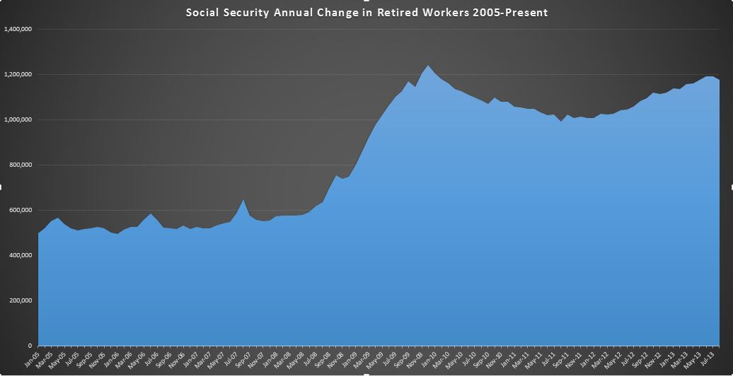
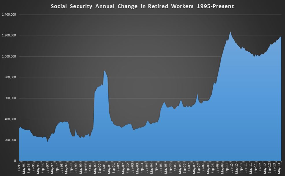
After a great start… by 1957 (Damn you FDR!!!), the math was starting to catch up and Social Security was running a deficit. And so it started. Taxes were raised… problem solved for a few years, until the math caught up again. Rinse, repeat, and here we are again… What will we do with the “Little Ponzi Scheme That Could”?

Hell if I know!! How do you tell 40M voting seniors and 60M  near retirement Boomers they’ve been paying into a Ponzi scheme 10,000X bigger than Bernie Madoff’s for their entire lives. The money is gone, and the only way to continue it is to screw over the younger generation even more than they already did with Obamacare. Also…they(the young) are young and stupid…you are old and frail…. (so it’s even right 🙂 ) I don’t know how it ends, but I am sure it’s gonna be bad for someone.