Category

Commentary

September 2013 Update : Social Security-Annual Change In Retired Workers

By | Commentary

The September numbers were just released…. the total Social Security population grew 140k to 57.695M people, with the average recipient receiving $1,162 per month. Penciling that out yields a very large number, but that’s not really what I am interested in. I watch this series because I am looking for a material change in the rate of retirements….which is what we would expect some time soon as we get into the meat of the baby boomer retirements.

For some reference, in the late 90’s, we were adding about 300k people to Social Security programs(Old age and disability) per year. By 2006/2007, the rate had edged up to about 700k per year of additions before spiking to over 1.6M in 2009 as millions jumped onto Social Security/disability after losing jobs due to the recession. Since then, it had slowly been drifting down, with the latest annual rate being 1.248M additions per year. For the month, last September had 155k additions, 15k higher than this September so the slow drift downward is continuing, but we are still adding a lot of people each year.

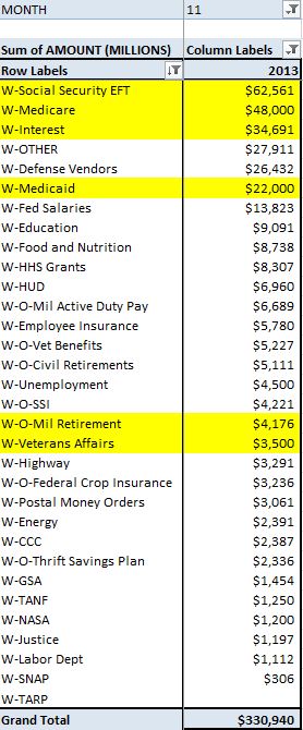
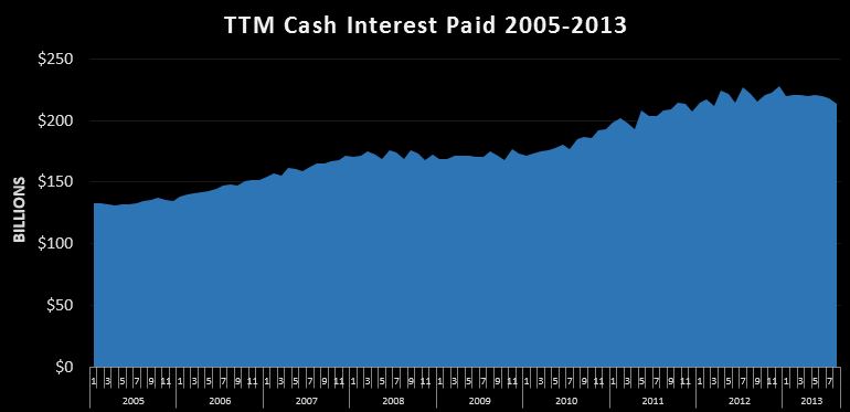
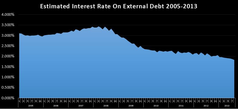
I guess you could say it’s a good thing that the rate is coming down, but the truth is, we are still adding people at a phenomenal rate, and that rate will likely be heading back up before too long. For reference…while SS is adding an average of 104k people to it’s rolls each month…the total population is growing at about 187k per month, and jobs are being added at 184k per month over the last 12 months. On the cost side, we are seeing growth of about $62B per year due to growth in the population and the annual cost of living adjustment. So all else equal, to keep the budget deficit constant, we need either 62B of new revenue each year, or need to make $62B in cuts….each year in perpetuity, and that # will probably start accelerating up over the next 5 years. So it’s bad, and getting worse. Remember all the drama last year surrounding the $85B sequestration?

Finally, just a thought on retirement choices. For most, you have a choice to apply for social security from when you turn 62 all the way up until 70, but the longer you wait, the more money you get. I suspect that for those who can, they try and work as long as they can. However, during the “great recession” many in the 62+ age group who lost their jobs couldn’t find jobs, and therefore took social security earlier than they would have liked at a reduced rate. Now, the economy isn’t quite as terrible, so more seniors are working just a tad longer…delaying their retirement, but ultimately increasing their potential payout. So while that may be temporarily suppressing boomer retirements, in the long run, the higher payments could actually make the long term situation worse.

On the other hand….why worry about the long run. The odds of this turd staying afloat for another decade, much less 30+ years is slim to none. I suppose one of the reasons I do this is just to document the absurdity in real time. None of this is rocket science. Anybody with a spread sheet and the ability to do middle school level math should be able to sit down and see that none of this will end well….and yet, a (vast?)majority of politicians and citizens seem deluded enough to believe we can just keep kicking the can. Hint Hint….we can’t 🙁

The Debt Limit Will Be Raised

By | Commentary

The news of the day is that Treasury Secretary Lew has announced 10/17 as his latest greatest estimate of when we will “for real” become unable to cover outlays with incoming cash. Remember….hitting the debt limit isn’t the problem(that happened back in May and was a completely voluntary event)…running out of cash to pay bills is the problem.

Looking at a partial month is problematic, so for simplicity, let’s just assume we run out of cash at the end of October. What would November look like?

Over the full month, per my current forecast, November should see about $202B of cash revenues, offset by about $331B of outlays, good for a $129B deficit. But the good news is….we can still pay for $202B of those expenditures. But how to decide what to pay…and what not to pay?(Normally…they would issue $129B of debt in exchange for cash…that will cease to be possible) That is the problem. $35B or so of interest is due…probably want to pay that. Rolling expiring debt isn’t a problem…..If I pay off $1B of expiring notes….then replace it with a new $1B issue…debt outstanding remains constant. Not paying Social Security, Medicaid or Medicare would save $133B, which is enough, but that probably wouldn’t end well. Active duty military pay??? Nope. below is my forecasted outlays….what would you cut?

09-20-2013 November 2013 Expenditures

And this is the dilemma our poor…poor politicians find themselves in…both Republicans and Democrats. The government spends about $3.8T per year, but only manages to bring in $3.0T of revenues. The plug is debt…..$800B. So now here we are….right at the debt limit. If it isn’t raised, all else equal…..we have to cut $800B of spending. But unfortunately…all else is not equal. If you cut $800B of spending….by definition that cuts GDP by $800B directly, and who knows how much indirectly. This in turn, cuts revenues, which cuts spending….it’s either a terrible or wonderful circle, depending on who you are. Just for reference $800B is equal to about 16M 50k per year jobs….perhaps 8M (or less)government jobs I suppose 🙂

That’s what it would take to balance the budget. Is that what you really want? Look folks…it’s simply not politically possible….therefore it will not be done. Oh sure….they may reach the limit for a few days or even a week….maybe “slow paying” some bills (trust me…the checks in the mail) but not for long and I doubt it even gets that far. The debt limit will be raised…not because it’s the right thing to do…but because it is the easiest thing to do.

Don’t get me wrong…I’m not endorsing this….it’s not what I think should happen, rather, it’s what I think will happen. Honestly, it’s almost certainly too late….this cycle will continue until it collapses on itself and all of this debt (on and off balance sheet) is simply defaulted on, probably by inflating it away.

Not that anyone has asked, but my solution would be over say a 10 year period (wish we could have started 10 years ago)  simply cut all non-essential and unconstitutional expenditures (including social security, Medicaid and medicare) 10% per year until they are zero….reducing taxes along the way. I would also default immediately on all $16.7T of debt outstanding….if you were dumb enough to lend money to Uncle Sam…..aka our congress with a single digit approval rating…. well…you deserve to lose your $16.7T.

Finally, when it was all said and done I would cut taxes to put them in line with the new expenditure requirements…probably somewhere between $500B and $1T per year. Yes…there are a lot of details to work out, and it would never actually happen, but the short term pain would be made up by long term prosperity…which is why it will never happen….it’s been a long time since anybody told the American people no, and I see no indication anybody is going to start now. The majority has found it’s way into the nation’s pocket book demanding pensions, schools, food stamps and infinite government paid medical care far beyond the nation’s willingness, or even ability to pay. No…there is no political solution here…the game will continue until it all crashes and burns. That day will come soon enough, but I doubt it is 10/17/2013.

Stay tuned….we look to be in for an interesting month.

House Republicans Propose Cuts To Food I-Phone Stamps

By | Commentary

From money.com the bill would cut $40B from the program over 10 years. For the math impaired…that’s $4B per year….yawn… But that’s not really the point I want to make. A while back I posted Hungry Kid = Irresponsible Parents detailing the actual cost to provide calories from different staples.

It turned out that providing 2500 calories a day for a month ranged from a low of $12.88 for vegetable oil (probably not a good idea, but a good reference point nonetheless) to a high of $475.26 for T-Bone Steak. More realistic perhaps was rice at $16.31, beans at $38.22, bread at $49.38, and chicken at $77.04.

Now…before someone goes off on how unhealthy all of these things are….since they aren’t organic and have a lot of carbs ect….that’s not what we are talking about. We aren’t comparing healthy diets to unhealthy diets….we are comparing not eating at all (decidedly unhealthy)…kids going to bed with nothing in their bellies….to how much it would cost to get something…anything even…onto that kids dinner plate.

And the answer is not very much at all. Using store brand bread, peanut butter, and jelly, you would be hard pressed to spend more than a $0.25…and that’s with a ridiculous amount of PB.

So here is my hypothesis….Food stamps aren’t really about food at all…they are about I- Phones, $100 a month cell phone plans, and countless other crap that the poor couldn’t afford….were it not for food stamps. It’s welfare…not just for the poor, but for the corporations who peddle them crap they don’t really need. There are 47.6 million people on food stamps per the article…..I’d be surprised if more than a million of them really need food stamps to ensure they have the $2 it would take to cook up a pot of beans and rice to avoid going to bed hungry.

What actually happens is this….any family that has at least one person working has enough money to at least feed themselves and put a crappy roof over their head. How do I know?….because I’ve done it. Not so long ago, while still in college, my wife and I had a monthly budget of $1200, which was about what we made from our two part time jobs. I don’t remember exactly, but we probably made about $7 an hour. That got us a 1 room apartment, food, bills, insurance and gas for two craptacular cars. Hell…we even had cable. It wasn’t the good life, but I surely never went to bed hungry. For the record, this was in back in 2001….not the 1950’s 🙂

So…while tight, the truth is…the simple life doesn’t really cost that much. Now take a family of four on a tight budget, and say they qualify for food stamps…$133 per person, so lets just say $500 per month. What happens now? Assuming they were spending $500 per month on food (doubtful)….now, all of a sudden, this frees up $500 of cash to spend on other things….like maybe a few I-Phone 5S’s and a couple hundred $ per month for an unlimited family plan.

Now…if we called them I-Phone stamps…. it would be hard to justify…but if instead we pretend like the money is only being used to buy food….for people who would otherwise literally be starving to death…well, it’s hard to argue against that. But…the facts just don’t support that story at all. Rather, as I explained in Hungry Kid = Irresponsible Parent, the truth is…99% of the time, if somebody (kid or adult) goes to bed hungry it isn’t because there wasn’t enough money to purchase nourishment, it’s because they (or their caregiver) decided to spend that money on something else instead.

Using the numbers in the article, 47.6M people x $133 per month pencils out to $75B per year….compared to the proposed $4B cut. I have a better idea. Cut the entire program and offset it by cutting taxes by exactly the same amount….a $225 per person credit ought to do it. In it’s place, take $1B to set up a private charity with the mission to feed the truly hungry. Have the president promote it and introduce it to the country, but after the initial $1B…cut it loose to be funded entirely by private donations. For the those truly at risk for being hungry….and not just at risk for making a late payment to AT&T, this organization would provide a monthly allotment of staples like rice and beans, ensuring that nobody in this country goes hungry. For the 46M or so that get dropped off of food stamps(assuming 1.6M are truly in need), well, they will be forced to make better financial decisions, which might just suck for Apple and hundreds of other corporations, but tough cookies….it needs to happen anyway.


Monthly Treasury Statement Vs. Daily Treasury Statement

By | Commentary, Methodology

I don’t think this will be a news flash for anyone, but as detailed here the Daily Treasury Statement (DTS) released daily by Treasury is the primary source of data used for all of the US Daily Cash Deficit posts. However, there is another Treasury report, the Monthly Treasury Statement (MTS), that the rest of the world is much more familiar with. Any time you hear an “official” revenue, outlay, or deficit number….odds are it came from the  MTS.

Now, you might be tempted to assume that the MTS is just the sum of the DTS…rolled up into a nice government report. Unfortunately, this simply is not the case. On several occasions, I spent more hours than I care to admit trying to tie the two out, failing miserably each time. After a chat with Treasury staff, I found out why…they are generated from completely independent data sets and simply are not reconcilable. During my attempts…I came across many many examples where the numbers from each report…in categories you would expect to be straight forward like NASA expenditures, were in fact off by 50-70% or more. As a result, as I’ve said before, I don’t like the MTS and I don’t trust the MTS.

Unfortunately, when I started blogging about the daily deficit last year, I made the assumption that for all it’s flaws, the MTS and the DTS were close enough. I based this on a comparison of FY 2011 and FY 2012, which over the twelve month period, despite monthly deltas, on the year was only off by $7B in 2011 and $3B in 2012…close enough for government work right?

Well, a few months ago, I decided to pull the historical MTS data and line it up with the DTS data, and while sure enough the 2011/12 FY are pretty darn close, not much else is. In fact, the average TTM difference over the last 5 years is $79B. At present, the TTM delta is $95B, with the cash deficit being $95B higher than the reported MTS deficit. Lesson learned…2 is not an adequate sample size.  This is likely to impact my world famous CBO vs CBO challenge, but I’ll tackle that another day.

While I can’t tie out the MTS to the DTS (since it’s not possible), I do have a pretty good idea of where at least some of the variance lies. The first thing you will notice about these two series is that DTS revenues are almost always higher than the MTS. The reason for this is that it represents the cash flows in for the entire federal government….and then some. My theory is that some of what ends up on the DTS is ultimately excluded from the MTS with the most prominent example being the US Postal Service. It would seem that USPS runs it’s business through treasury bank accounts, resulting in cash source of about $87B per year. On the outlays side….they have gone out of their way to make it difficult to track. They split out postal service money orders, but apparently not op costs. I assume that payroll gets grouped together with “Federal Salaries”. So as far as I am concerned, I can probably assume that the $87B of cash in is offset by probably $100B or so of outlays, contributing to about $13B of deficit (lot of assumptions there) However, on the MTS, you can probably bet that the revenues and outlays are completely excluded, and somewhere treasury makes an entry indicating a $13B loan…that I’m pretty sure will never be repaid…thus excluding it from the official deficit calculations. I catch it in the cash deficit…they purposely exclude it.

This is just the largest item….I’m sure there are more, plus untold amounts of “modified accrual” shadiness going on that account for the differences. So, I’ll just go ahead and say it….in my opinion the MTS is a bogus report that simply can’t be trusted. When all else fails….all we can rely on is the cash flow statement, and the DTS is the only timely reliable source of that for the time being. As long as government accountants can slice and dice and exclude whatever they want, you simply can’t trust the reports they generate.

So…why do I trust the DTS??? you probably are wondering? Well, I don’t dismiss the possibility for shadiness, but for the most part, the DTS is verifiable. Cash in less cash out damn well better be equal to delta cash and delta debt. Debt is separately verifiable, and cash is just about the last thing you want to lie about because it is the first thing any auditor is going to look for. Finally…these reports are generated daily with a 24 hour turnaround. Creating fraudulent financial statements takes time (I assume 🙂 ) , so the risk here is less than something bureaucrats have a few weeks to fiddle around with.


August 2013 Monthly Statement Of Public Debt

By | Commentary

Every month, Treasury releases the Monthly Statement of Public Debt(MSPD) which gives us a detailed breakdown of the public debt outstanding…each issue still outstanding, rates, terms ect..

“Why is this interesting?” you may be asking yourself. Well…it’s interesting for me because we get to compare the actual issue rates over time. You see…bond yields are in constant motion…changing every single day in response to market forces, fed manipulation ect… Investors can make or lose fortunes on those moves, but just like your 30 year mortgage, once issued, the borrower, in this case the US government, has effectively locked in a rate for the duration….so any fluctuations after the fact have no affect on the future cash outflows for interest and ultimately principal repayment.

So…let’s start out by looking at the 30 year bonds….with about $1.5T outstanding.

09-13-2013 30 year Bond rates

The chart shows all of the outstanding 30 year issues dating back to 1985 at 11.25%. You can clearly see the downward trend bottoming out a year ago at 2.75% in the August and November 2012 issues. More recently…the May 2013 was issued at 2.88%…this was before the increase in rates we have been hearing about. Sure enough, the August 30’s were issued at 3.63%, a .75% increase. That’s not a good sign, but it’s not exactly time to panic (at least not about rates). Rates on the 30 are still historically low, and the $16B issued last month isn’t even large enough to move the needle on the weighted average rate on the 30’s, much less the entire $12T outstanding.

Moving down to the 10 year with about $2.2T outstanding:

09-13-2013 10 year Bond rates

The rate on the 10 year has fallen steadily from the May 2006 issue at 5.13% bottoming out in August and November 2012 at 1.63%. As with the 30 year, the issue rate increased 0.75% from 1.75% in May 2013 to 2.5% in August.

There were no new 60 month issues, but I’ll throw the chart out there just for fun.

09-13-2013 5 year Bond rates

The pattern in the 60 is quite similar, moving off earlier year lows up about 75 basis points in recent months.

09-13-2013 3 year Bond rates

Finally, a look at the 3 year with $1.2T outstanding, which has been bouncing around 0.25% for a few years now, recently rising to 0.63%.

We could continue marching down the line, but the rates on everything shorter than 36 months are essentially zero….the 12 month rising from 0.11% to 0.14% is going to have a negligible effect the cash interest paid..I’ll start worrying about those when they get closer to 1% or so.

So what does it all mean? I’ve been saying for a while that when the Fed loses control of rates it will be game over for the deficit. Perhaps we’ve seen a 0.5% across the board increase in the past few months (including bills, which haven’t moved much)…have they lost control? I don’t think so…not yet anyway. Don’t get me wrong, they will lose control, and this surely is not a good sign (for them…it may be good for savers), but we’re just not there yet. They still seem to have no problem selling debt at not much higher that historic lows, even if a good chunk of that is being bought indirectly by the Fed.

So while this is definitely bad news, odds are this will be a very slow motion train wreck. With $12T of debt already locked in, much of it at rates higher than current rates, it will take years of higher rates to materially change the cash interest paid.

09-13-2013 TTM cash interest paid

Above is a snapshot of the trailing twelve month cash interest paid. Even as the debt was skyrocketing, thanks to lower rates, the actual interest paid has increased only 61% from $133B to $214B over the same time period public debt outstanding nearly tripled from 4.4T to $12T.

09-13-2013 TTM estimated interest rate

This chart shows us my estimated interest rate by dividing the TTM cash payments by the average public debt outstanding over the prior twelve months. the moderate uptick in rates has not stopped the decline in the total effective rate as older debt is being retired and rolled into lower rates, even if those rates are a bit higher than they were 3 months ago. We are currently at about 1.8%, and it took over 4 years to coast down 1% from 2.8% in April 2009.

To wrap it up, I will just say that not a lot has changed….things are as bad as they’ve been, but exceptionally low interest rates are still enabling the government to carry a massive debt load. Rates are climbing off of historic lows, but it will take another % or two rise in rates and a few years before it really starts to show up in the cash deficit. With $12T outstanding, a 1% rise in effective rates would cost an additional $120B per year in interest expense…which would be added to the deficit and grow exponentially from there. We’re not there yet, but stay tuned. If rates continue to go up, the destructive power of compound debt will be unleashed on the annual deficit, providing the final nail in the coffin, finishing up what Social Security started. In short…yes, we are still doomed.