Category

Commentary

US Daily Cash Deficit 9/4/2013

By | Commentary

The US Daily Cash Deficit for 9/4/2013 was $3.3B pushing the September 2013 deficit through 4 days to $38B compared to just $3B over the comparable period in 2012. Revenues…up $4B yesterday YOY lose a bit of ground…are now at $+3B, a 10% YOY increase, but honestly, this early, there isn’t much predictive value with only 2 data points.

09-4-2013 USDD

There really shouldn’t be much action over the next week…just moderate daily deficits with the occasional moderate surplus. We’ll probably hit next Thursday with an additional $15-20B of deficit, just say $55B. Then, Friday 9/14 and especially Monday 9/17, tax revenues will start pouring in. Last year over the similar 2 day period, we ran an 84B cash surplus …it will be very interesting to see how this year turns out.

August 2013 Update : Social Security-Annual Change In Retired Workers

By | Commentary

The August Social Security monthly update came out last week, but I am just now getting a chance to look at the latest results. If you aren’t familiar with the report, basically, it gives us the number of participants in the Social Security program, both the Old Age and Disability portions of the program. It also gives us average monthly payouts per category, and some demographic male/female breakout.

So…in a given month, the given population changes in two ways. First, new people reach retirement age or become disabled, adding to the population. Second, retired workers pass away, or disabled workers recover and join the workforce. Just to frame it, the current population on Social Security is 57.554M or 18% of the total US population and the average monthly payout is $1,162 per month.

In my prior two posts on June and July, I focused primarily on the retired worker population…by far the largest at ~37M. To continue that analysis for August, the monthly change was an increase of 71k over the prior month ending up at 37.575M people compared to last months increase of 112k people. So great news right? Well…not exactly. See,  there is a lot of seasonality involved, driven by retirement and death patterns that cause a lot of variation in rates over the year. December is generally the lowest,  at 59k in 12/2012. January is typically the highest at 171k of additions in 1/2013. The rest of the months fall somewhere in between. So…rather than comparing the monthly change to the prior month…it is best to compare to the year ago delta.

August 2012 had an increase of 85k, so this is an actual improvement, bringing the TTM change down a hair from 1.191M to 1.177M, still within a stones throw of the December 2009 1.240M record. So despite the small improvement, we are still adding people to the program at nearly a record rate and this rate will almost certainly continue to trend up over the next decade as we get into the meat of the Boomer retirements.

09-01-2013 August Social Security TTM

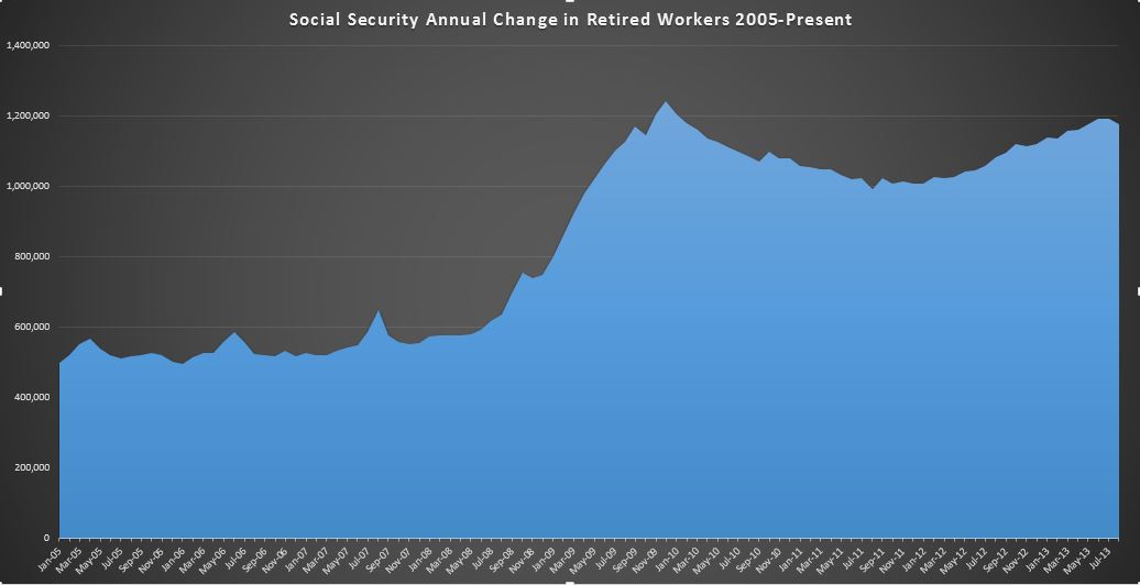
This is the same chart we’ve seen in prior posts, but I’ve narrowed the range only showing 2005 to present. You can clearly see the 2005-2008 average of about 500k doubling during the great recession to the 12/2009 peak, trending down, and then back up to the current peak just under 1.2M per year rate. You can see the small dip at the end….I wouldn’t get excited about that yet…but we will keep an eye on it.

Now, lets take a step back and look at the entire population. It includes disability, currently at 8.9M and growing at about 12k per month over the last year, as well as various subcategories of spouses, widows, and children. The entire population grew 82k to 57.554M, down from the year ago increase of 103k. Lets take a look at the chart:

09-01-2013 August Social Security TTM-Entire Population

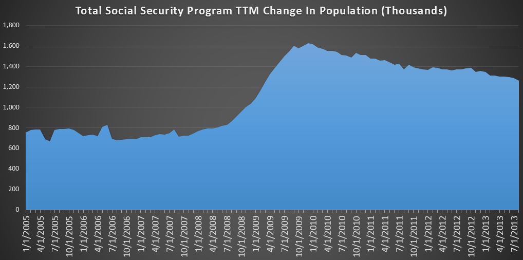
This chart looks a bit less menacing. After following the same trend up to 1.6M per year the rate is has steadily declined to around 1.26M per year. As it turns out…most of the other categories seem to have more or less stabilized, with retired workers, and to a lesser degree disabled workers being the only materially changing categories. Still… 3 years past the great recession, we are nowhere near to the normalized rates we saw leading up to 2008. Bottom line, the TTM cash cost of SS related programs was $710B over the last 12 months, and is growing at an annual rate of $60B. By the time the next president takes office in Jan. 2017, that annual rate will be around $922B. By Jan. 2021…it will be closer to $1.2T.

So…to wrap it all up, 85k added to the welfare rolls in August 2013. The overall rate slowly is declining…for now, but the annual add is still nearly twice the pre-recession rate, and likely to turn back up before too long as the Boomers keep retiring in droves. There is no happy ending here…it will just get worse and worse and worse until it is ultimately defaulted on with the rest of the debt.


43% Pay No Income Taxes!! Well…not exactly…also-Fun with Math

By | Commentary

They pop up every couple of months…today by Jeanne Sahadi  at money.com. Now quite honestly, this one…if you bother to read it is better than most(but I’ll pick on it anyway), but the headline still blares out….”43% Pay No Income Taxes“. That’s terrible you probably think….nearly half of the population is getting a free ride. Those lazy slacking  (and literally) poor SOB’s…. Except… there’s just one little thing…these numbers always exclude employment taxes…for social security and medicare. As I detailed a few months back in Social Security: Crappy Deal…Getting Worse …Fica is a bona fide income tax of 15.3% of all income earned up to like $110k or so. So…that guy making $50k may not pay a lot of “income tax” as defined by the study, but he does pay $7500 a year for something that looks like an income tax, walks like an income tax, and smells like an income tax.

So let’s just cut the crap. FICA is an income tax…I laid out my hypothesis in Proof (well…circumstantial evidence) Social Security Implemented As Stealth Income Tax. Anyway…the bottom line is that these articles get me riled up because they are generally intellectually dishonest and just try to rile up tension between different income groups… If you want to play those kind of games fine…but do it for real and include the 15% FICA as income tax. Of course, nobody would click on that headline…”8.25% pay no income taxes”.. but I digress 🙂 So let’s skip over that and look at some math.

Lets take a typical family of 5 with an annual income of $50k. We know they pay $7500 of FICA taxes a year…but what about “income taxes.”

Right off the top…take off $12,200 for the standard deduction and another $3900/person for exemptions ($19,500) and you get down to $18300 of taxable income. The 10% tax bracket runs to $17,900, so if this was it…they’d be on the hook for about $1,800. But…take out some for medical, maybe some modest 401k and HSA contributions, maybe some business losses on a not so popular blog…getting down to $10k of taxable income could happen without too much effort, so $1k of income taxes.

But wait…they have 3 kids….and are almost certainly eligible for a 1k per kid credit…so they are eligible for a $2k refund (1k -3k=-2k) as it stands. Depending on the circumstances…they could probably push their income up to $65k or so before they technically started paying taxes, and this is a pretty cookie cutter scenario. No judgement here…but that’s the math….it’s pretty damn simple. So odds are, a good chunk of families making under $65k per year technically don’t pay “income taxes”. All I’m saying is that I’m not amazed, and this shouldn’t be a story at all….if these writers were capable of basic math, they would see that it actually makes a whole lot of sense. In fact, I’m surprised it’s not quite a bit higher…. Clearly…you don’t need to be a tax cheat to avoid “income taxes”…just the ability to do 3rd grade math.  Oh well…I’m sure our journalist’s sentence diagramming skills are impeccable.

Syria: I am a 91%er

By | Commentary

So the news of the day is…Obama has decided to bomb Syria. Pat Buchannan frames the issue quite well in his post today. I like this quote:

“The only thing we learn from history is that we do not learn from history.”

Holy hell…what is Obama thinking….I won’t make an essay of this…others far better informed than me have already done this, but for what it’s worth… President Obama…I am a US citizen…and I stand with the other 91% of my countrymen who do not approve of this war you seem determined to drag us into. I truly hope that for once, Republicans and Democrats can unite against this terrible mistake before it is made. For what it’s worth…email your congressmen and demand they take action.

July 2013 Monthly Statement Of Public Debt

By | Commentary

I stumbled across this series a few months ago and have started digging into the July issue released yesterday to see if there is anything interesting. Well…interesting is probably not the right word…but I think you know what I mean.

The MSPD gives us some insight into the makeup of the public debt…giving us a summary  all of the outstanding debt…from the $40B of 1 month bills issued 7/25 at 0.02% to the $10.5B of 30 year bonds issued back in 1985 at 11.25%…a rate that is 562.5X higher than the current one month. That’s interesting right?

First…some thoughts. The treasury bills (0-12 months) are not particularly interesting at this point in time. The average rate on the $1.6T outstanding is less than 0.1%, and as discussed in a prior post….the interest paid annually on this is something like $1.5B. The rate paid could double, triple, or even grow 10X, and it would still more or less be a rounding error. So…I look at it, but until the rate gets up past 0.5% or so…it’s just not material. Why would anyone lend Uncle Sam $1.6T at effectively zero? I have no idea!!

Bonds… the 30 year securities…we don’t get a lot of movement here. They are only issued every 3 months, and none are due until 2015. The average rate on the $1.4T outstanding is around 6%, though the latest issue back on 5/15/2013 was at 2.88%. It will be interesting to see what the new August issues go for…looks like it may be over 3.5%. That’s a pretty big hike, but still well under the average of the bonds outstanding, including everything issued after 2011. Of the bonds expiring in the next 3 years, the average is about 10%…so rolling those into new bonds today would result in a reduction of annual interest expenses.(but who knows what they will be in 3 years)

Notes (2-10 years)… This is where all of the action is….we have notes expiring and being issued each and every month, and the balance…at $7.7T makes up 64% of the public debt outstanding. In July, we had $94B of notes expire. Since of course the US never actually pays off debt…they just roll it…it is interesting to see what is rolling off, and what it is being replaced with.

So… In July, we have a 2 year issued at 0.38% roll off…and we had two new 2 year issues…averaging 0.31%. √

A 3 year at 1% rolled off…and a new 3 year was issued at 0.63%. √

And… a 60 month at 3.38% rolled off…replaced by a 60 month at 1.38%…a big improvement. √

And this has been the story over the last 3 years or so. Debt outstanding is increasing at around $1T per year, but the interest rates are being driven down by Fed manipulation. So..in July 2011, the cash interest paid over the prior 12 months was $204B on 9.8T of public debt outstanding. 2 years later…the cash interest paid on 11.9T of public debt was only$218B. This could continue on for a few more years…even as rates have bounced off some extraordinary lows…they are still extremely low historically speaking.