Fun With Math: Reliant Free Weekends 24 Plan

By | Commentary

First off…the disclaimers…this is my analysis, based on my understanding of my scenario, after discussing with two door to door salesmen…and reading about the plan on Reliant’s site here: I’m not a Lawyer, but in my opinion, the whole thing is intentionally hard to understand. That said…here goes.

So, I get home from work, and just as soon as I sit down for dinner….doorbell rings, and 2 door to door salesmen from Reliant/NRG show up. First off…seriously? Everybody in the whole world hates door to door salesmen…come on Reliant….stop going out of your way to make people hate you….. But the guys were nice enough…. so I humored them for a few minutes.

They were trying to sell me a 24 month electric plan….and give me a free NEST thermostat. It would save me a ton of money they said….and…Weekends are free….from 8PM Friday to Midnight Sunday…. They went on for a while, before I ultimately send them packing….and decided to figure out whether or not this was really a good deal or not.

Spoiler alert!!!…it’s not.  Here’s how it works….Weekends aren’t actually free, you still have to pay the delivery charge, which is 4.1 cents per kwh. In exchange for the “Free” weekends…you pay a much higher rate(roughly double the going rate) during the week…the 4.1 cent delivery charge, plus an 11.6 cent energy charge, for a total of 15.7 cents per kwh. The advertised blended rate is 12.4 cents….which I suppose looks about right.

Now, obviously energy usage varies quite a bit depending on the month and the time of day….I could do a lot more detailed analysis, but I doubt it would come up with much different of an answer, so I’ll keep it simple.

I use about 20,000 kwh per year, or 40,000 over a 2 year contract. Using straight average usage, about 31% of that would be at 4.1 cent per kwh…or 12,381 at a total cost of $508. The remaining KWH, 27,619 would be charged at 15.7 cents per kwh, for a total of $4336. My total charges over the 2 year contract would be $4844, which works out to $202 per month and 12.1 cents per kwh.

There’s just one big huge friggin problem. If I go over to www.powertochoose.com …. in about 30 seconds I find a 2 year fixed price plan for 8.4 cents per kwh, meaning the Reliant “Free Weekends” plan is 44% more expensive. (but you do get a free nest…) This option pencils out to $3360 over 2 years, or $140 per month. The reliant plan would cost me $62 a month more….$1,484 over 2 years. If I read it right…there could be about $10 additional fees in the Reliant plan that I wouldn’t pay with the other plan…but I’m not 100% sure on that…so just ignore it or go read the fine print…. maybe you will have better luck than me.

Now….the door to door salesman would probably say…yeah, but the NEST will save you a ton of energy off the bat, and if you do all of your laundry on weekends….you can shift power from high price weekdays to cheap weekends. I call BS on that the savings…my old school programmable thermostat works just fine, and I doubt I could shift that much usage without it becoming way more hassle than it’s worth.

So for me….this plan doesn’t even come close to penciling out for anyone except Reliant/NRG and my friendly, but extremely annoying and time wasting salesmen, who I assume get a decent sized commission for the task of trying to convince you to make a nearly $1500 mistake (in my case…your mileage may vary)

So the lesson is….don’t be stupid people….It looks to me like Reliant/NRG has gone out of their way to make an overly complicated electric plan to make a huge profit margin from people who aren’t so good at math. Just get a regular old fixed price contract…save money, and run your dishwasher whenever the damn thing gets full 🙂
US Daily Cash Deficit 2/26/2015

By | Daily Deficit

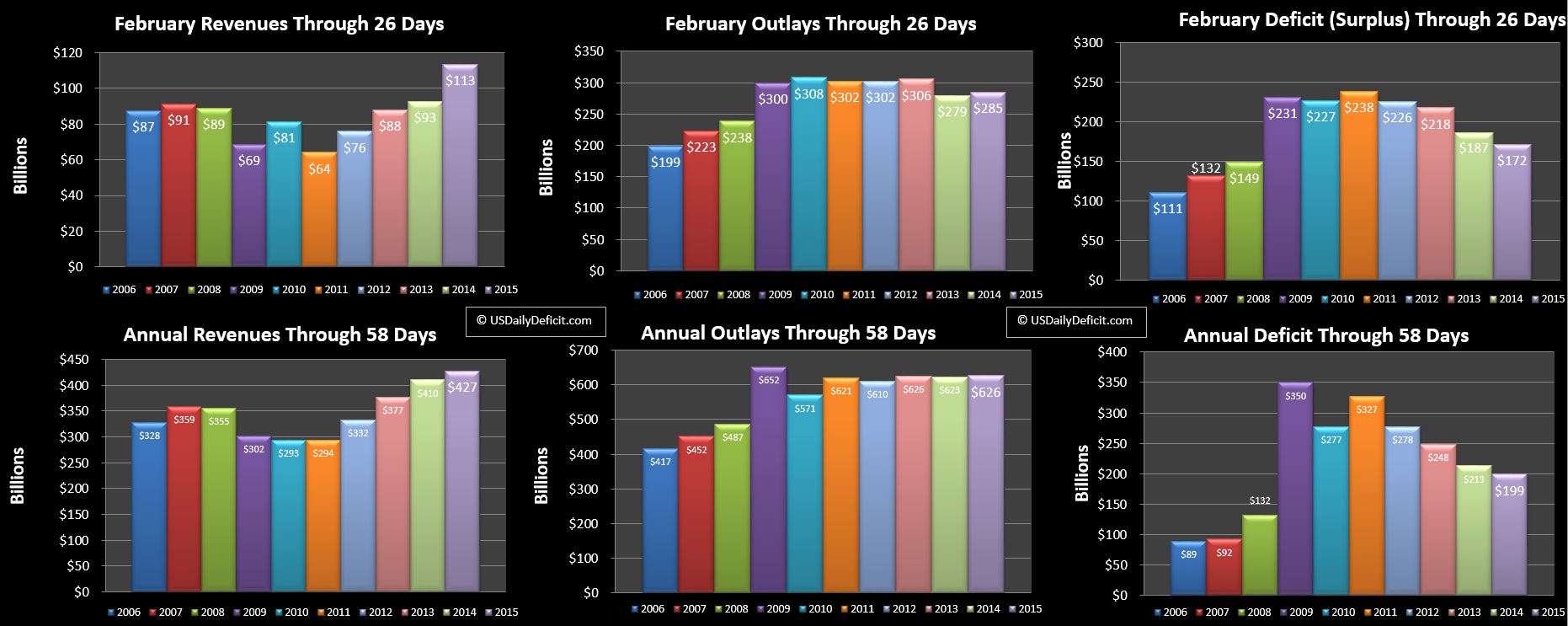
The US Daily Cash Deficit for Thursday 2/26/2015 was $7.8B bringing the February 2015 Deficit through 15 days to $172B.

2015-02-26 USDD

The most surprising thing about February so far is that refunds have kept pace with 2014. Looking at the YTD….2014 was at $124.5B compared to 2015 at 125.2B. In my forecast, I had reduced my expected refunds by about $10B due to all the hype about Obamacare….looks like maybe it was just that.

Revenues are up about $20B….$10B of that is refund timing, and the rest is bonafide revenue growth. Outlays are at +$6B….primarily interest payment timing…..which will be be offset by another interest payment at the end of the month….where ~$6B of interest payments slip to 3/2 due to the weekend.. Put it all together, and revenue is looking at about +4% on the year, with outlays more or less flat. If I had to guess….with 95% of the data in, Friday 2/27 will post about a ~$30B deficit pushing us just over $200B for the month, and just under my $210B forecast.

January 2015 Update: Social Security Enrollment

By | Commentary

It’s been 7 months since my last SS update, so first a quick refresher. SS is a broad program best known for the retired worker program…..where you pay in a portion of your paycheck each week, and in return, will hopefully get a monthly check once you reach~65….for the rest of your life. As of January, there were 39.1M retirees collecting an average of $1,331 per month, which pencils out to $52B per month, or $625B per year. This population is growing at about 1.1M per year…that is new retirees less deaths of existing enrollees = 1.1M per year.

Moving on…the second largest piece of SS is Disabled Workers, with 8.9M people receiving an average of $1,165 per month. The balance is about 10 smaller categories of children, spouses, widows etc…. of retirees and disabled workers. Each month, the government releases a report here that details the new monthly totals, their average monthly benefit, and even the Male/Female split if that interests you.

Any one report isn’t all that useful, but by compiling them and tracking the monthly and annual changes, one can squeeze some useful, or at least interesting data out of them. I track them for two primary reasons. First, SS is a huge part of the cash deficit, …$773B over the last 12 months ending in January, good for 20% of cash outlays, and growing at 5% per year. Supposedly, at some  point over the next 5 years, we should start hitting the meat of the Baby Boomers, resulting in a notable increase in enrollment and cost….I want to see it in real time.

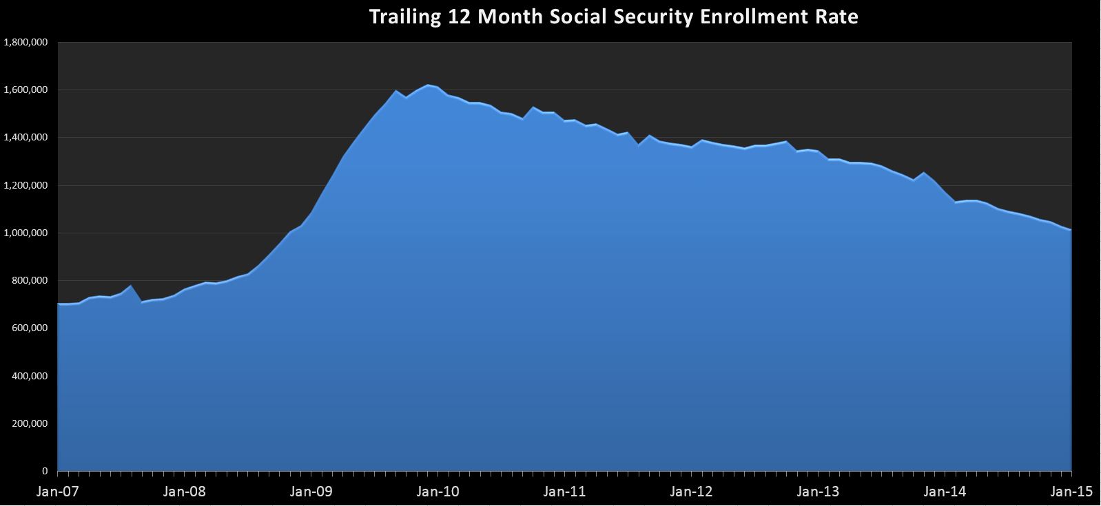
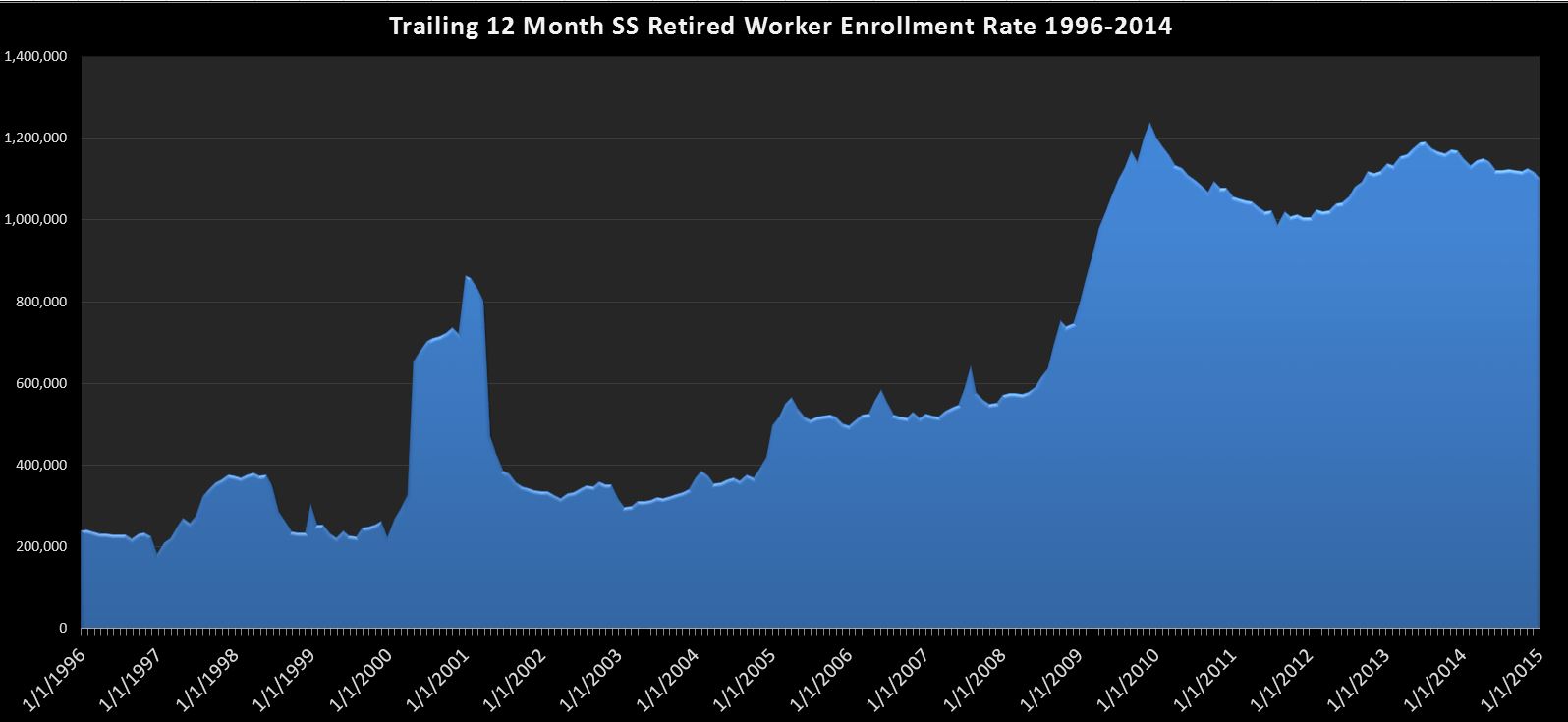
Second, as you will see in the charts below, there is a noticeable correlation between the state of the economy and the SS enrollment rate. In the “Great Recession”, we saw enrollment rates more than double from 2007 to 2009. Again, this series gives us a real time window into the decisions millions are making…. It may or may not be a leading indicator, but it is certainly worth watching because if we have another spike, whether from the boomers retiring or a recession, it will have a noticeable affect on the deficit.

First up…just the retired workers chart:

2015-02-24 SS-Retired Workers

Here we can see the relationship between the economy and the rate of SS enrollment with a spike in the 2000-2002 time frame and again in 2008. Since then, it has remained elevated, but is slowly trending down over the last ~1.5 years. It’s still pretty bad…at over 1.1M per year, but really no material change since my last report, so i guess that’s a good thing. If…or when we see this swing back around and start heading toward 1.5M….you can be sure trouble’s a’brewin.

Next, we look at the whole program:

2015-02-24 SS-SS-ALLHere’s what you need to know….During the spike we saw in 2009+, most of the categories, especially disability and retired workers were growing in unison, leading to a peak growth rate of over 1.6M per year. However, since then, with the exception of retired workers, everything has more or less stabilized, including disabled workers which had been growing as much as 400k per year at one point. This leaves retired workers as the primary driver in program enrollee growth. So it’s no surprise that the trend is more or less the same…a continued decline in the annual enrolment rate that is still quite a bit higher than the historical trend.

Put it all together, and the truth is…not a whole lot to see here, and that’s a really good thing. If this chart starts to get interesting, there’s a good chance it will be because the deficit is zooming back toward $1T as revenues collapse and expenses spike higher…..just like the good ‘ol days 🙂

US Daily Cash Deficit 2/20/2015

By | Daily Deficit

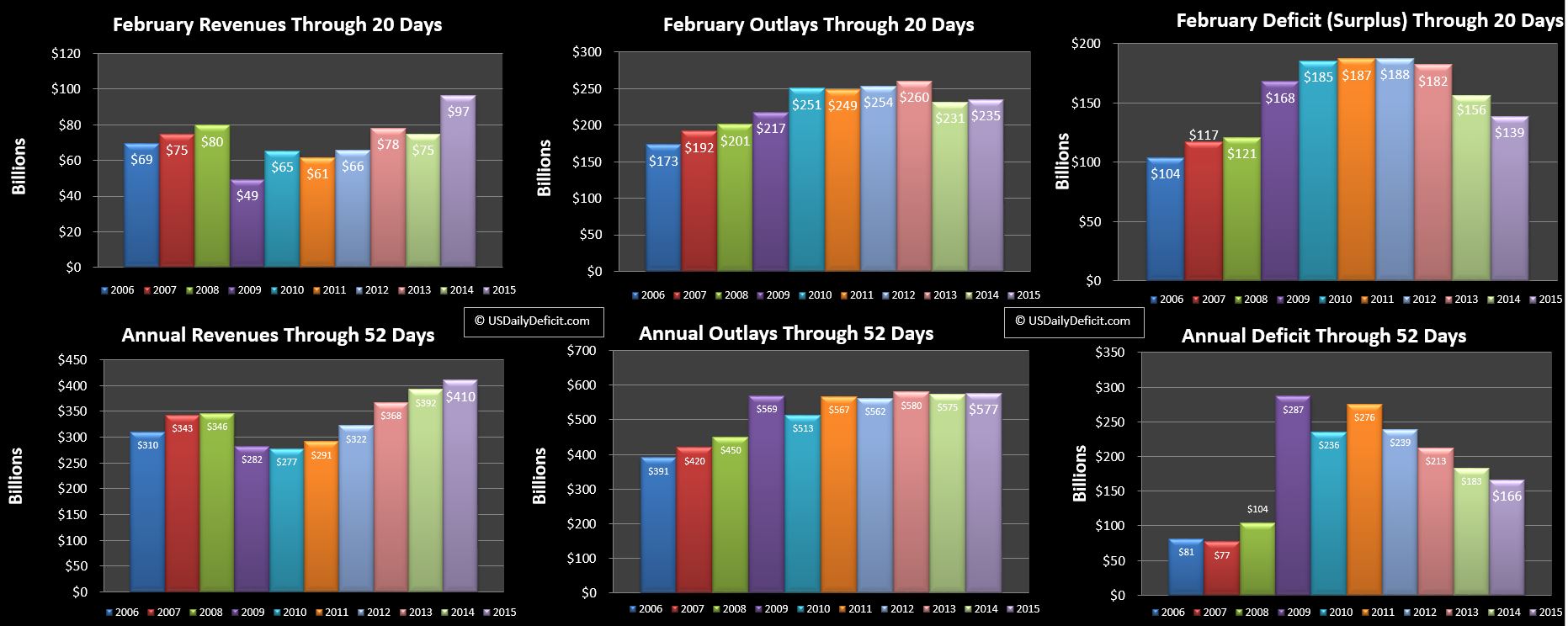
The US Daily Cash Deficit for Friday 2/20/2015 was $3.7B pushing the February 2015 deficit through 20 days to $139B.

2015-02-20 USDD

Revenues are still looking ok at +$22B, with outlays more or less flat. Refunds, excluding the $10B of timing, are more or less on pace with last year. For the year, 2015 has $100B of individual tax refunds vs $99B last year…..so we aren’t seeing a drop off due to Obamacare  or anything like that, at least not yet. We have 5 business days left, and are more or less on track to hit a $200B deficit +/-10B or so. Through 52 days, revenue is up 4.6%, a bit worse than I had expected, and outlays are flat versus my expectation of 2-3% growth.

US Daily Cash Deficit 2/17/2015

By | Daily Deficit

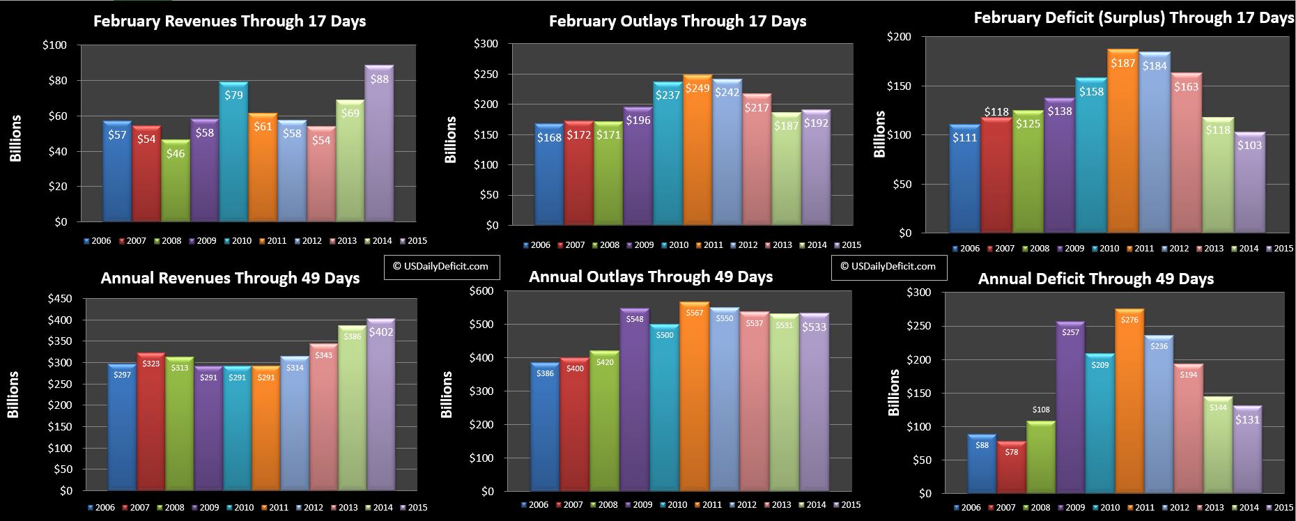
The US Daily Cash Deficit for Tuesday 2/17/2015 was $18.6B as strong post holiday revenues were overwhelmed by $37.5B of interest payments.

2015-02-17 USDD

For the most part, our timing issues are behind us, giving us a fairly clean YOY comparison. Revenue is up a healthy $19B….About $8B of that is lower refunds….primarily timing related. I don’t really see a material slowdown in refunds due to “obamacare”…yet. Last refunds over the last 8 days of the month ran at about a $6.5B clip per day….if 2015 runs even $1B per day under that it could open up a big gap by the end of the month.

Outlays stand at +$5B, which is basically flat after pulling out the $6B of interest that slipped from January to February. Put it together and despite the $103B deficit, we seem on track to put a good month in the books as revenue is growing and outlays are flat. If we stay on this course, we have a chance to slide in under a $200B deficit, but it is really going to come down to refunds.

Shifting down to the second row of charts, 2015 revenue is looking ok…at +4%, with outlays pretty much flat.