It’s been 7 months since my last SS update, so first a quick refresher. SS is a broad program best known for the retired worker program…..where you pay in a portion of your paycheck each week, and in return, will hopefully get a monthly check once you reach~65….for the rest of your life. As of January, there were 39.1M retirees collecting an average of $1,331 per month, which pencils out to $52B per month, or $625B per year. This population is growing at about 1.1M per year…that is new retirees less deaths of existing enrollees = 1.1M per year.
Moving on…the second largest piece of SS is Disabled Workers, with 8.9M people receiving an average of $1,165 per month. The balance is about 10 smaller categories of children, spouses, widows etc…. of retirees and disabled workers. Each month, the government releases a report here that details the new monthly totals, their average monthly benefit, and even the Male/Female split if that interests you.
Any one report isn’t all that useful, but by compiling them and tracking the monthly and annual changes, one can squeeze some useful, or at least interesting data out of them. I track them for two primary reasons. First, SS is a huge part of the cash deficit, …$773B over the last 12 months ending in January, good for 20% of cash outlays, and growing at 5% per year. Supposedly, at some point over the next 5 years, we should start hitting the meat of the Baby Boomers, resulting in a notable increase in enrollment and cost….I want to see it in real time.
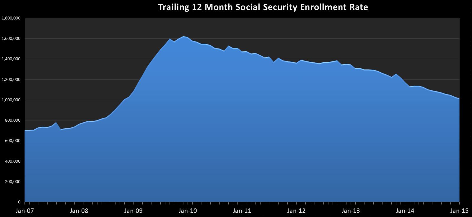
Second, as you will see in the charts below, there is a noticeable correlation between the state of the economy and the SS enrollment rate. In the “Great Recession”, we saw enrollment rates more than double from 2007 to 2009. Again, this series gives us a real time window into the decisions millions are making…. It may or may not be a leading indicator, but it is certainly worth watching because if we have another spike, whether from the boomers retiring or a recession, it will have a noticeable affect on the deficit.
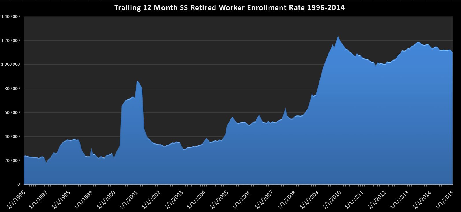
First up…just the retired workers chart:
Here we can see the relationship between the economy and the rate of SS enrollment with a spike in the 2000-2002 time frame and again in 2008. Since then, it has remained elevated, but is slowly trending down over the last ~1.5 years. It’s still pretty bad…at over 1.1M per year, but really no material change since my last report, so i guess that’s a good thing. If…or when we see this swing back around and start heading toward 1.5M….you can be sure trouble’s a’brewin.
Next, we look at the whole program:
 Here’s what you need to know….During the spike we saw in 2009+, most of the categories, especially disability and retired workers were growing in unison, leading to a peak growth rate of over 1.6M per year. However, since then, with the exception of retired workers, everything has more or less stabilized, including disabled workers which had been growing as much as 400k per year at one point. This leaves retired workers as the primary driver in program enrollee growth. So it’s no surprise that the trend is more or less the same…a continued decline in the annual enrolment rate that is still quite a bit higher than the historical trend.
Put it all together, and the truth is…not a whole lot to see here, and that’s a really good thing. If this chart starts to get interesting, there’s a good chance it will be because the deficit is zooming back toward $1T as revenues collapse and expenses spike higher…..just like the good ‘ol days 🙂

Catch up (June/July 2018 Cash Deficit)