Monthly Archives

June 2013

Social Security Analysis 6-2013

By | Commentary

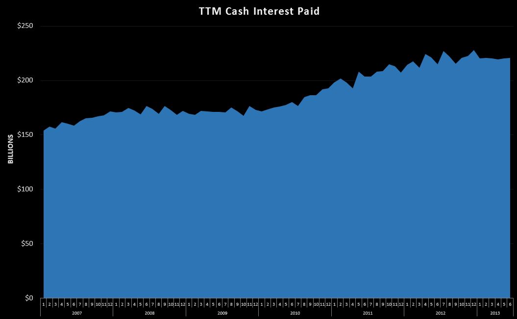
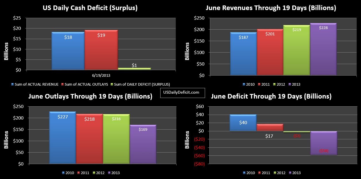
Yesterday I did a brief analysis of interest payments, which make up about 5% of our annual outlays. My conclusion was that rising interest rates will ultimately blow this category sky high, but for the time being…at least a couple years or so, I don’t expect this to be a huge problem because rates are incredibly low, and more or less locked in for long enough to blunt any sudden move in rates.

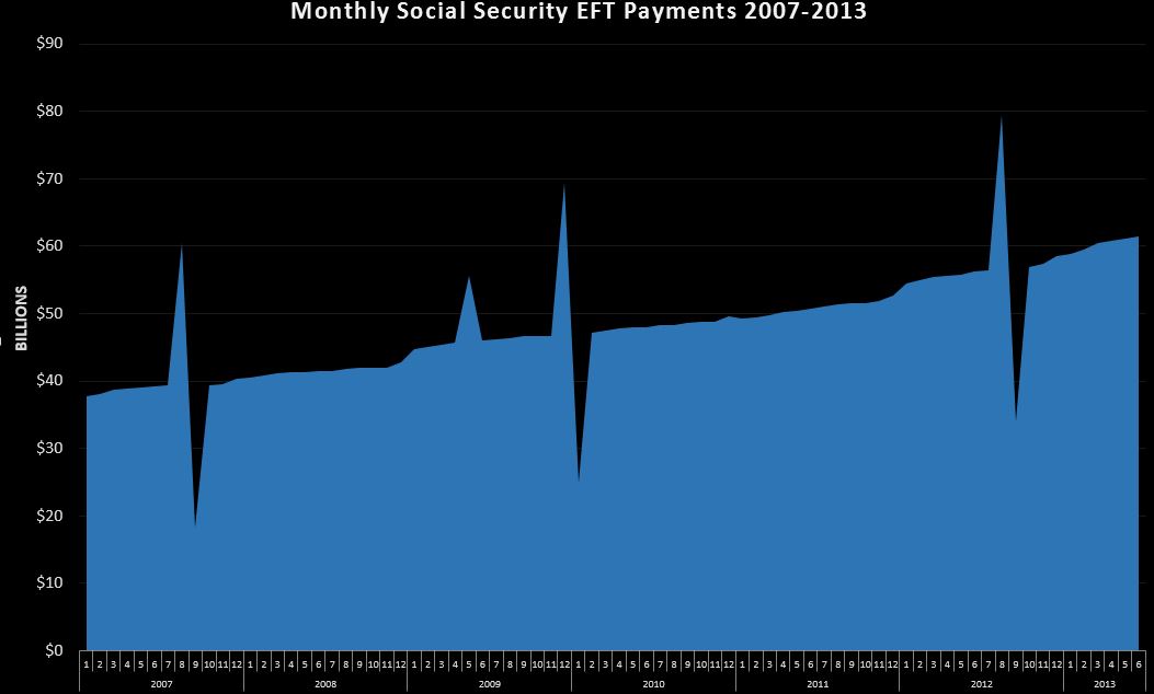
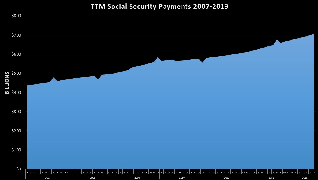
Today, I want to take a similar look at Social Security, which is a problem now, and will continue to be. So…looking back at 2007 for some scale…in January, Social Security EFT were $38B, $469B for the whole year. Fast forward to May-2013…the monthly outlays were $61B, and the TTM was $700B….18% of all cash outlays over the past 12 months.

One quick note. On the DTS…only payments made by electronic transfer are captured…paper checks, though a small %…fall through to “other”. In the past, I have seen estimates that in the past 90%-95% of social security payments were electronic transfers. Obviously, this population would not stay constant. I think it would be a safe assumption that the paper checks go to the older recipients at a higher rate than younger (relatively 🙂 ) recipients. So…as the older recipients with paper checks pass away, and are replaced by younger recipients who prefer direct deposit…the$ of SS EFT’s would grow…even if SS total payments were constant…somewhat skewing our analysis. Early this year, they actually made a push to eliminate paper checks…not sure how successful that was, but there were some notable upward blips in the data consistant with this, so it is probably safe to say that there are only a few % left. All together, I think the population of paper checks, and the rate of change associated with it are small enough to more or less ignore…I just wanted to put it out there for full disclosure.


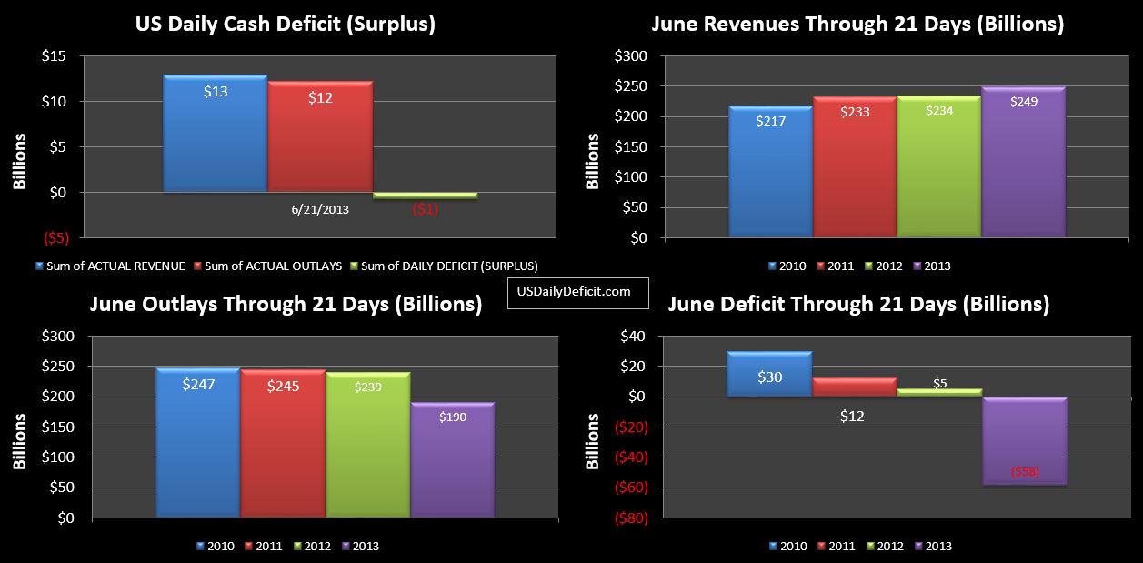
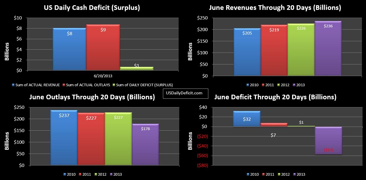
So let’s start with the charts:

The monthly:

06-25-2013 Social Security Monthly

and the TTM:

06-25-2013 Social Security TTM

So the first question you probably have…what are those huge saw-tooth looking swings? Most of these are caused by timing…where the first social security payment due the third of the month is pulled into the prior month due to weekends/holiday ect… This causes a spike, then dip that is very prominent in the monthly, and even apparent on the TTM. This isn’t common, but it does happen every year or so. There is one additional spike in May-2009 related to stimulus…I believe about $13B of extra payments were made in an effort to buy votes stimulate the economy.

The charts are clear…Social security is huge, is growing, and that growth is expected to accelerate over the next 10 years. I’m no actuary, but I recently looked at some age tables a while back and the next 10 years should see a accelerating growth as we get into the meat of the Boomer generation. For example…per the data I have… about 2.7M people will turn 65 in 2013.  next year spikes up to 3.7M…trending up to around 4.5M per year by 2025.

Note…the SS population is in constant flux…people retire every day, and people pass away every day. Right now…we seem to be adding about 125k people per month to the program(consolidated…retirement and disability ect…), with a year over year growth of about $60B per year and headed higher. So in the context of the entire budget…just to stay even each year…you have to come up with an additional $60B+ per year of cuts or new revenue…in perpetuity just to stay even. A year or two…we can probably cough up…but after 10 years…you are talking about a huge hole that appears to be too massive to fix.

This is the ticking time bomb I expect to blow the budget apart in the long run. From $700B per year now….in just five years…June 2018 assuming 6-7% annual growth, we will cross the $1T per year threshold. Who thinks we will elect someone in 2016 on a “cut social security” platform?? Didn’t think so. Over 57M people currently get checks each month….with 60M or so Boomers in line for their cheese…..The math suggests a very unhappy ending for all.


6/21/2013 Daily US Cash Deficit

By | Daily Deficit

The US Daily Cash Surplus for Friday 6/21/2013 was $0.7B as those “tax deposits not withheld” continue to flow in strongly. So while they were off to a slow start…the longer tail has helped close the gap to -6% vs last year….not nearly as dire as the -20% we were looking at earlier in the week, but still well under the +32% gains we saw over the first 4 months of 2013.

06-21-2013 USDD

The Chart continues to faux impress (is that a phrase?) Revenues up 6%, cost down 20% due to timing, and bona fide decreases in outlays. I’m still waiting for the $60B from Fannie Mae…early reports from last month had mentioned it being paid in June, but I haven’t heard a peep since then. At first, this surprised me, but then I thought…. the circumstances surrounding it are so shady, I guess I’d try and keep it quiet too. 5 days left….then on to July and August…expect ~$100B deficits in each :(. Oh well….the surpluses were fun while they lasted.

Interest Rates Rising – What Does It Mean For The Deficit??

By | Commentary

At $221B over the last 12 months, cash interest paid on the public portion of the debt isn’t huge…it’s about 5% of all outlays, but it holds an incredibly important role in the future of the debt/deficits. To fully understand why…let’s go back about 6 years to the beginning of 2007. Public debt outstanding was at $3.8T, and annual cash outlays for interest were at $152B. Fast forward to the end of May-2013…where public debt outstanding was $11.9T with the aforementioned $221B of cash interest payments. Does that sound a bit off to anyone?

06-24-2013 TTM Cash Interest 2007-2013

It should…Over the same time period that publicly held debt outstanding has more than tripled, cash debt payments has only increased 45%. It’s a really sweet deal….if you can get it…and by actively manipulating the market (screwing over savers in the process) that is exactly what the government has accomplished. The key, of course, is lower rates…declining from an estimated 3.2% in 2007 to about 1.9% as of the end of May. I say estimated…I take the TTM cash payments, and divide it by the average public debt outstanding over the prior 12 months. No…it’s not perfect, but applied consistently I think it tells right story with an acceptable margin of error.

06-24-2013 Interest Rates 2007-2013

So some quick math…just say we can assume 2007’s 3.2% was a “normal” number….something we could plug into a 50 year forecast. I’m not sure it is, but let’s go with it. At that rate…we would be spending $380B per year on external interest payments…$160B over the current run rate. Over the 10 year timeframe our congress critters seem to prefer….It would be a lot more than $1.6T due to the magic destruction of compound interest. This in an era where we can’t even agree on simple cuts that will only save a few billions a year.

It has long been my theory that this is the true primary reason behind low interest rates. Not stimulating lending, or the economy, or making housing affordable…those are all just cover stories for this….manipulating interest rates down to near zero is the only way in hell the government can afford to finance the budget without the whole thing blowing sky high. That is why my thesis is that they simply cannot allow rates to go higher at all, and so when they invariably do go higher…it indicates that the Fed has lost control, and things could get very ugly very fast.

This is why I believe this is one of the most important charts I track each month. Once that curve starts to head up and crosses 3%…the long term deficit is going to take off, exposing what has been obvious for quite a while anyway…the US government will default on on and off balance sheet debt sooner or later….the only question is when, and who gets screwed the most (Seniors, veterans, government employees…all of the above?).

So…if you’ve been to a finance site recently…you’ve probably heard that rates are headed up across the board. Is this the end?? Well…let’s look at some data. It looks like…from yahoo finance, that the 6 month bond has increased 50% from .06% to .09%. That’s an incredibly low rate….so bumping it up 50% is more or less inconsequential for now. Say $1T of the $11.9T debt is 6 months or less….assuming I have my decimals in the right place…that’s only $1.2B per year at .06%…or $1.8B at .09%….rounding errors really.

Obviously, the 6 month is only a small piece of the market, but I think the illustration works for the entire spectrum…extremely low rates have increased a bit in the last few weeks, but are still extremely low. Furthermore….the $11.9T of debt is fixed for terms of  days, up to 30 years…. so while bondholders are immediately affected by rate swings, treasury more or less only has to worry about the debt it is rolling, about $600B per month(primarily short term), plus any new deficits that need financing…say $75B per month. To further complicate things, we are using the cash interest payments, which are going to lag issuance by up to 6 months.

So…for now, while it’s not a good sign, I don’t see the action in rates over the last month creating an immediate crisis, but perhaps sowing the seeds for an inevitable crisis down the road. It will be months before these rather small (in the big picture….maybe not so much if you were betting with leverage the other way) increases in rates flow through to cash, and even then they probably won’t be noticeable. Still….very interesting stuff to keep your eyes on. I’ll probably start sounding the alarm when the rate creeps back up past 2.25% and looks like it is trending up. Given the vast size of the market…this isn’t going to happen overnight. Even if the seeds have indeed been sown in the last few weeks… I think it could be a year or two before enough debt is rolled at higher rates to start seeing a materially higher cash interest expense.  I guess when it comes down to it, we all know how this parade ends….it’s the timing that we aren’t sure about.

6/20/2013 Daily US Cash Deficit

By | Daily Deficit

The US Daily Cash Deficit for 6/20/2013 was $0.7B bringing the June 2013 Surplus through 20 days to $57B. While declining, tax deposits “not withheld” did not drop off as steep as they did last year, putting a $2B dent in the YOY gap, and pushing the 21% decline we had through yesterday down to 15%. With a $6B gap remaining, it doesn’t look like we will come close to posting a 32% YOY gain like we saw with the first four months of the year. While obviously anything could happen…a second month of actual declines from this revenue category seems likely at this point.

06-20-2013 USDD

With six days left…I’ll go ahead and forecast the June deficit, if for no other reason than to see how much I can miss it by 🙂 Flipping back a few weeks, I think my last estimate was $105B surplus. As it sits, we are at $57B. I’ll add $60B for the rumored Fannie Mae payment….though I find it odd that I have not been able to find any recent news stories on this. That gets us to $117B surplus. I’d actually be happy staying with $105…assuming that we’ll run a $12B deficit (excluding Fannie) over the next 6 days, but that seems a little light, so I’ll bump it down $5 and just guess and even $100. If Fannie doesn’t come through, or we get some other surprise revenue…like from Tarp or Freddie….I could miss big, but I don’t really have a good way to guess those…we’ll just have to wait and see.


6/19 Daily US Cash Deficit

By | Daily Deficit

The US Daily cash deficit for 6/19/2013 was $1.1B….marking the first deficit in a few days 🙁

06-19-2013 USDD


The charts continue to look impressive, but it is mostly an illusion based on the apparent large drop in outlays…. $47B. I want to revise some of the numbers I threw out yesterday, after closer analysis today, I didn’t quite have it right when I pondered that $12B of the improvement was related to social security timing…forgetting that I had already adjusted for that by including an additional day in 2012.

Of the $47B, I am now estimating that $35B, rather than the $30B I have been using all month is a better estimate of the costs that shifted into May. Of the remaining $12B, as of today, I am left to believe these are bonafide decreases in outlays(through 19 days). Just eyeballing it…looks like defense vendor payments are down $4B and education department programs are down $4B, with the rest spread around a dozen smaller categories. I wouldn’t get too excited yet, but facts are facts….lets see what happens.

Revenues continue to disappoint (me at least). Net revenues are up 4% YOY, taxes withheld are up 8%, and taxes not withheld are down 21%. Corporate taxes are still up 9%. The key to any long term budget solution is first holding cost constant….something we have actually been able to do for the last 3 years or so (not for much longer though…thanks to social security). Second…you have to be able to grow revenue…for a sustained period of time at or around 10%. For reference…2010 actually decreased over 2009, but was basically flat. 2011 posted an 8% increase and 2012 posted 6%. For a brief moment in time… the first 4 months of 2013…we were running at 15%…very impressive. Yet…after the tax season…we find ourselves sinking back to the middle single digits.

If you’ve ever modeled exponential growth…you realize that the difference between 5% and 15% in year one can be pretty big by the time you get out to year 10. The CBO is projecting 10-12% growth for the next 3 years….I’ll be surprised if we get half that after 2013. Add a sell off in the stock market, and even a mild recession, and you could go negative in a quarter or two….completely tanking the rosy CBO projections our brilliant politicians are using to make extremely important decisions (not that it really matters)..Ok..enough doom and gloom…I should probably wait a for a few more months of data…after all…we should be getting a cool $60B from Fannie Mae any day now…